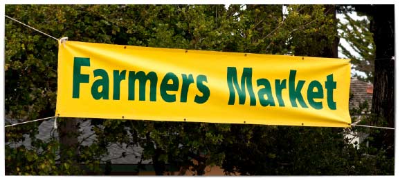
Imagine this scenario: It’s launch day. The client loves your creative and so do you. You couldn’t wait to see it in-market. Then you see it and your heart sinks. You realize the design you worked so hard to perfect simply isn’t readable. You thought everything was big enough, but somehow your graphics just don’t have the same impact as they did on your comparatively tiny monitor.
What Makes a Sign Easy to Read?
There are two things to keep in mind when designing large format graphics:
- How far away from the actual signage will the reader be?
- How long with the average reader have to absorb the message?
Font Size on Signs
| Letter Height | Ideal Distance | Maximum Distance |
| 3″ | 30′ | 100′ |
| 4″ | 40′ | 150′ |
| 6″ | 60′ | 200′ |
| 8″ | 80′ | 250′ |
| 10″ | 100′ | 400′ |
| 12″ | 100′ | 400′ |
| 15″ | 150′ | 630′ |
| 18″ | 180′ | 750′ |
| 24″ | 240′ | 1000′ |
| 30″ | 300′ | 1250′ |
| 36″ | 360′ | 1500′ |
| 48″ | 480′ | 2000′ |
| 60″ | 600′ | 2500′ |
Simply put, your copy needs to be large enough to be read from a distance and brief enough that the average reader can absorb the message within the likely exposure time.
A good rule of thumb is that for every 10’ between your reader and your signage, add 1” to the height of your letters. A 1” tall character can easily be read by most people from a distance of 10’, but from 40’ away, you will need your type to be at least 4” tall for optimal readability.
While people may still be able to read your sign from further away than the optimal distance, how much further depends on factors outside your control like weather conditions, architectural features and the eyesight of the reader. The commonly accepted maximum reading distance for a 4” tall letter is around 150 feet.
Think about the average viewing distance that most people will be at when they are exposed to your signage, then use the character visibility chart to the left as a guide to the ideal size for the copy on your sign.
How Much Time it Will Take to Read Your Sign
The average American reads at a rate of about 250 words per minute. That’s about 4 words per second. This number is even lowing if your target reader happens to be driving past a building at 50 Km/h.
The faster the driver, the fewer words you really have to get the message across. When it comes to signage, the faster someone can absorb your message, the more effective your signage will be.
Choosing The Ideal Letter Size for Your Sign
When choosing letter height for your signage, think about how it will be displayed:
- Where will it be – in your retail store? On a billboard at the side of a highway? On the floor of a tradeshow? In a transit shelter?
- How quickly will readers move past your sign? Will they have the opportunity to stop and read? Or will they need to grasp everything important in a single glance?
- How far away will they be?
Once you have a clear idea of the viewing distance and length of exposure most people will have as they pass by your sign, you can use the table in this article to choose an ideal letter height, and estimate whether you have the right amount of copy.
Other Things to Keep in Mind When Printing Signage
There are other factors can affect how easy it is for people to read your signage. These include the colours you choose for your signs, how copy is placed relative to any images or other graphics, and the fonts that you use. Look for upcoming blog posts to learn more about how to design effective signage.
Get in Touch
Have a project to quote? Get in touch with a Hemlock print specialist. We’re here to help!
